Step 1: KPIs
Make a list of the key performance indicators you want to show on your dashboard. Try to group the metrics into thematic areas. For example a Human Resources dashboard the groups might be (i) recrutiment metrics, (ii) workforce metrics, and (iii) retention metrics.
Step 2: Meaningful Time Spans
Decide the most meaningful increment of time each of the dashboard metrics will display (current, hourly, daily, weekly, monthly quarterly or annually). You may want to design your dashboard to give you an instantaneous snapshot of the current situation. You may want to update your dashboard once a month for the monthly management meeting. You may even decide to display and compare the same metric over different time increments (for example the current number of open positions compared to the trend over the last year).
Step 3: Pick Visualisations
Decide which dashboard widgets you want to use to display each of your metrics. The following widgets are available:
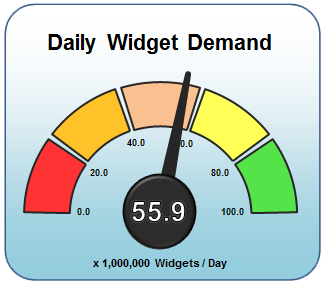
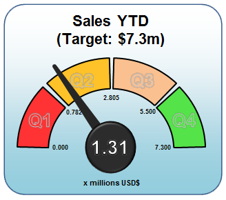
- Linear Dial Widget
- Non-Linear Dial Widget
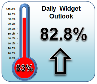
- Thermometer Widget
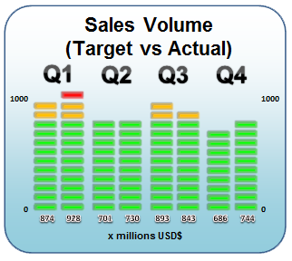
- Equalizer Widget
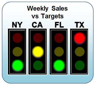
- Traffic Light Widget
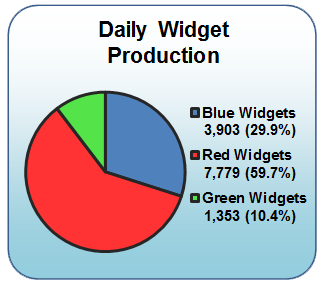
- Pie Widget
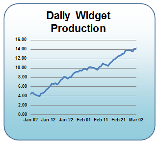
- Trend Widget
- Up/Down Widget
- Funnel Widget
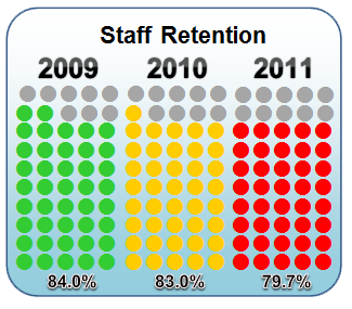
- Dots Widget
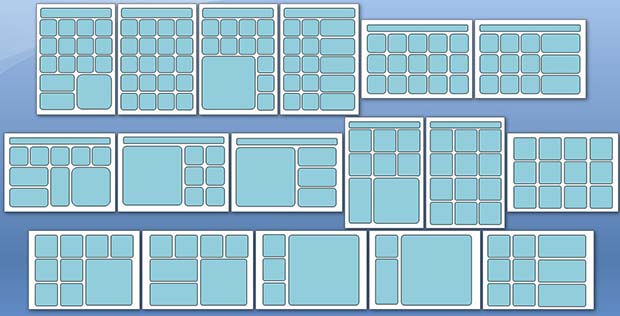
Step 4: Layout
Choose a layout. Generally it is good practice that a dashboard should fit on a single landscape screen or single printed sheet of paper (either landscape, portrait). Users should not have to scroll, turn pages, or drill-down to find the necessary information. The following are example layouts that fit onto a single sheet of paper.
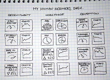
Step 5: Wireframing
Sketch your dashboard out on paper. It is significantly easier to first design a dashboard on paper than to build it straight in Excel.
Step 6: Excel Setup
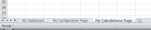
Now it’s time to create your dashboard in Excel. Open up a new Excel Dashboard Widgets spreadsheet and set up three new tabs as follows..
Tab #1 – rename as ‘My Dashboard’
Tab #2 – rename as ‘My Configuration Page’
Tab #3 – rename as ‘My Calculations Page’
Step 7: Copy and Paste
Copy and paste the widgets you want to use from the Excel Dashboard Widgets ‘Widgets Showcase’ Tab onto Tab #1 and arrange them into your required dashboard layout. Use the cell lines to help you line the widgets up neatly.
Step 8: Configuration Tab
Copy and paste the configuration tables from the ‘Widgets Showcase’ onto Tab #2 and arrange them in a similar layout to the dashboard layout.
Step 9: Calculation Tab
Copy and paste the relevant widget calculations tables from the ‘Widget Showcase Calcs’ tab into Tab #3.
Step 10: Final Step
Now comes the difficult part – you need to link these three tabs together in exactly the same way as the widgets are linked together on the ‘Widgets Showcase’. More information on duplicating widgets can be found here in the forum..